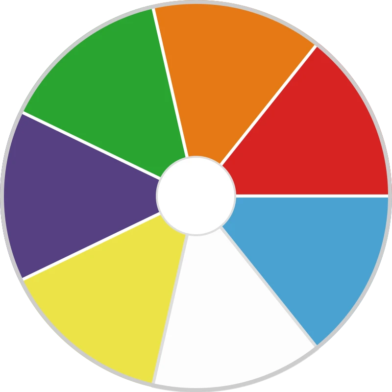
Click on the colour wheel to spin it and see which colour you land on! The wheel is fully editable, so you can tailor it to your own preferences.
The colour wheel, also known as a colour picker, is a fundamental tool in the world of design and visual arts. It serves as a visual representation of the relationship between primary, secondary, and tertiary colours, making it an indispensable resource for artists, designers, and anyone working with colours. Let us take a closer look at the history and structure of the colour wheel and discuss practical applications and ways to harness its potential in your creative projects.
The concept of a colour circle dates back to antiquity. The Greek philosopher Aristotle was one of the first to investigate the relationship between colours and developed the theory that colours are created by the mixing of light and dark. His ideas laid the foundation for the development of colour theory.
However, it was England's Sir Isaac Newton who first constructed a colour circle in 1666. After observing the dispersion of white light into a spectrum of colours through a prism, he arranged these colours in a circle to demonstrate the relationships between them. This led to the creation of the first colour circle, an instrument that has been adapted and refined throughout history.
The modern colour wheel consists of three primary colour groups: primary, secondary, and tertiary colours. Let us take a closer look at each group and its corresponding colours.
The primary colours are red, blue, and yellow. These colours are considered the basic colours because they cannot be obtained by mixing other colours. Any other colour on the colour wheel can be formed by combining the primary colours in different proportions.
Secondary colours are created by mixing equal parts of two primary colours. Examples include green (a mixture of blue and yellow), orange (a mixture of red and yellow), and purple (a mixture of blue and red).
Tertiary colours are created by mixing equal parts of a primary colour and an adjacent secondary colour. There are six tertiary colours: red-orange (vermilion), red-purple (magenta), blue-purple (violet), blue-green (turquoise), yellow-green (chartreuse), and yellow-orange (amber). You can see all these colours on the colour wheel above. Spin the wheel (by clicking anywhere) to make one of these colours appear randomly.
One of the most important benefits of the colour wheel is that it shows the relationships between colours. By understanding these relationships, designers and artists can create visually appealing and harmonious colour schemes. Some of the most common colour relationships are:
Complementary colours lie directly opposite each other on the colour wheel. When these colours are used together, they create a striking contrast, making them a popular choice for creating visual appeal. Examples of complementary colour combinations are blue and orange, red and green, and yellow and purple.
Analogous colours lie next to each other on the colour wheel. These colours often share a common hue and create a harmonious, calming effect when used together. Examples of analogous colour schemes are blue-green, blue, and blue-purple, or red, red-orange, and orange.
Triadic colours are evenly distributed across the color wheel and form an equilateral triangle. This colour scheme offers a balance between contrast and harmony, making it a versatile choice for designers. An example of a triadic colour scheme is the combination of red, blue, and yellow.
A split complementary colour scheme involves choosing a base colour and the two colours directly next to it. This arrangement offers a similar contrast to a complementary colour scheme, but with a greater variety of colours. An example of a split complementary scheme is red, blue-green, and yellow-green.
Now that we understand the colour wheel better, consider some practical applications and ways to use this essential design tool in your creative projects.
The colour wheel is an essential tool for graphic designers, enabling them to create visually appealing designs with harmonious colour schemes. By selecting colours based on their relative positions on the colour wheel, designers can ensure that their projects have a cohesive and professional appearance. This is especially important when designing branding materials such as logos, business cards, and websites.
Interior designers often use the colour wheel to create harmonious and visually appealing spaces. By understanding the relationships between colours, designers can create environments that evoke specific emotions or atmospheres. For example, a complementary colour scheme can create a bold, high-contrast look, while an analogous colour scheme can result in a more soothing, serene environment.
Fashion designers also use the colour wheel to create visually appealing garments and accessories. By understanding colour relationships, they can develop cohesive collections with a uniform colour palette. This helps fashion designers create garments that are easy to combine, ensuring versatility in a wardrobe.
Painting and visual arts
Artists engaged in painting and other visual arts can use the colour wheel to develop harmonious and visually appealing compositions. Through insight into colour theory and the relationships between colours, artists can create dynamic contrasts or subtle, nuanced colour transitions. Furthermore, the colour wheel can be a valuable tool for learning and practicing colour mixing techniques.
Photography and film production
Photographers and filmmakers can use the colour wheel to enhance the visual appeal of their work. By gaining insight into colour relationships, they can create images with striking contrasts or harmonious colour schemes. This can be achieved through set design, clothing choices, or post-processing techniques such as colour correction.
The colour wheel is an indispensable tool in the world of design and visual arts. By understanding the relationships between colours and the various colour harmonies, artists, designers, and creative professionals can create visually appealing and cohesive works. Whether you are a graphic designer, interior designer, fashion designer, painter, photographer, or filmmaker, the colour wheel is an essential resource that can help you take your projects to the next level and harness the power of colour in your creative endeavours.
More information: Yes or no | Team draw generator